


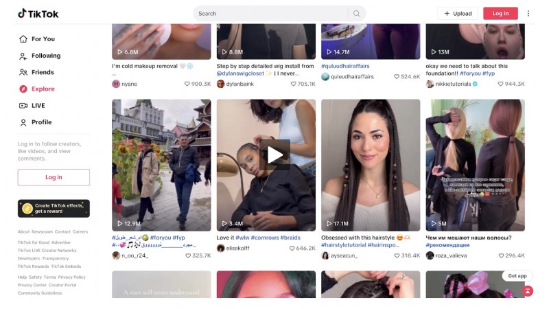
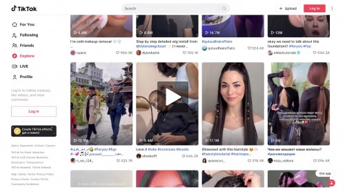
Have a kid? Go to TikTok
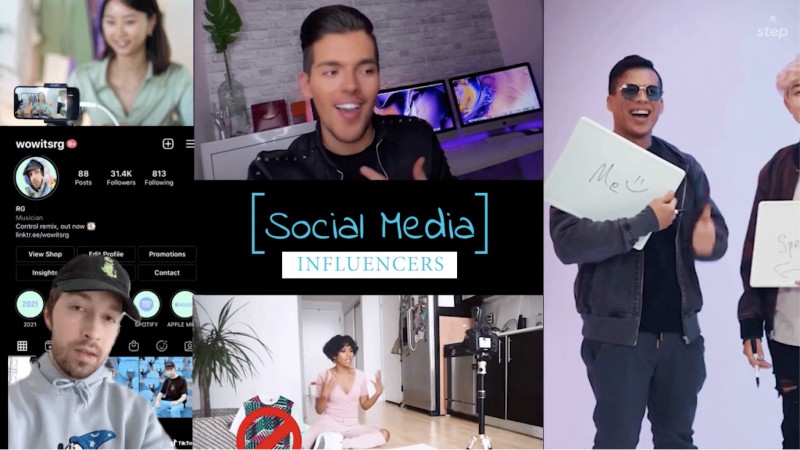
With social media like TikTok and its influencers, the world of "easy to recognize" ads is gone. Here’s a video to help you understand how your kids are manipulated online...

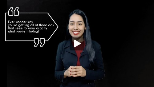
Getting a Lot of Personalized Ads?
Your behavior online determines the type of ads you get, a lot of the time. See what's happening and control the ads you see.
Worried About Your Kids Being Manipulated Online?
If your kids spend time online, they're likely encountering "social media influencers" who may try to manipulate their opinions or decision-making.

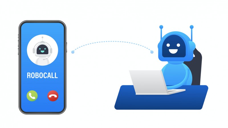
Video: AI - From Fun to Violations
AI is everywhere nowadays. How is that impacting your life? Learn more about AI and how to keep you safe with this video.

Privacy Trouble: You Didn't Do This, Did You?
Your personal information is worth a lot of money to many people, while sharing too much information online can cost you dearly. Check it out in this video...

Loud Budgeting, and Other Unusual Money Habits That Can Make You Money!
Everybody can use a little extra money every now and then, right? You can work harder or work more, but you could also decide to adjust your money habits to get there.

AI: From Fun to Violations
The increasing use of artificial intelligence (AI) and technological innovations are happening faster than us people can keep up with.

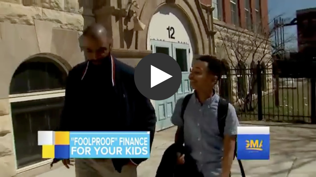
Can Credit Cards Hurt Young People?
Have a credit card and little income? Then it's likely you're carrying a credit card balance... And that can (start to) hurt a lot.


